Hey there! Do you need help creating effective email templates that engage your audience and deliver results? Look no further than the role of white space in email design. White space is the often-overlooked aspect of email design that can make all the difference in creating visually appealing and effective email templates. It enhances the design's visual appeal, improves readability, emphasizes key elements, reduces visual clutter, increases click-through rates, and reduces email fatigue. In this article, we'll discuss the critical role of white space in email design and provide tips for incorporating it effectively into your email templates. Let's dive in!
The Role of White Space in Email Design
In this section, we'll discuss the often-overlooked role of white space in email design. White space is a powerful tool that can enhance the visual appeal of your emails, improve their readability, emphasize crucial elements, and increase engagement rates. So, let's get started and discover the power of white space in email design!
- Improves Readability: White space helps to break up the text and make it easier to read. It provides a visual rest for the eyes and helps to reduce eye strain. This can increase the chances that the recipient will read the entire email.
- Emphasizes Key Elements: White space draws attention to the critical elements of the email. It allows the recipient's eyes to focus on specific areas of the email, such as the call-to-action button or a headline.
- Enhances Visual Appeal: A cluttered email can be overwhelming and unappealing. By using white space, designers can create a clean, visually appealing design that will likely engage the recipient.
- Increases Click-Through Rates: A well-designed email incorporating white space can increase click-through rates. By emphasizing the call-to-action button and reducing visual distractions, recipients are likelier to take the desired action.
- Reduces Email Fatigue: Email fatigue is a common problem where recipients become overwhelmed by the sheer volume of emails they receive. Incorporating white space into email design can make emails more visually appealing and easier to read, reducing the risk of email fatigue and increasing engagement with the recipient.
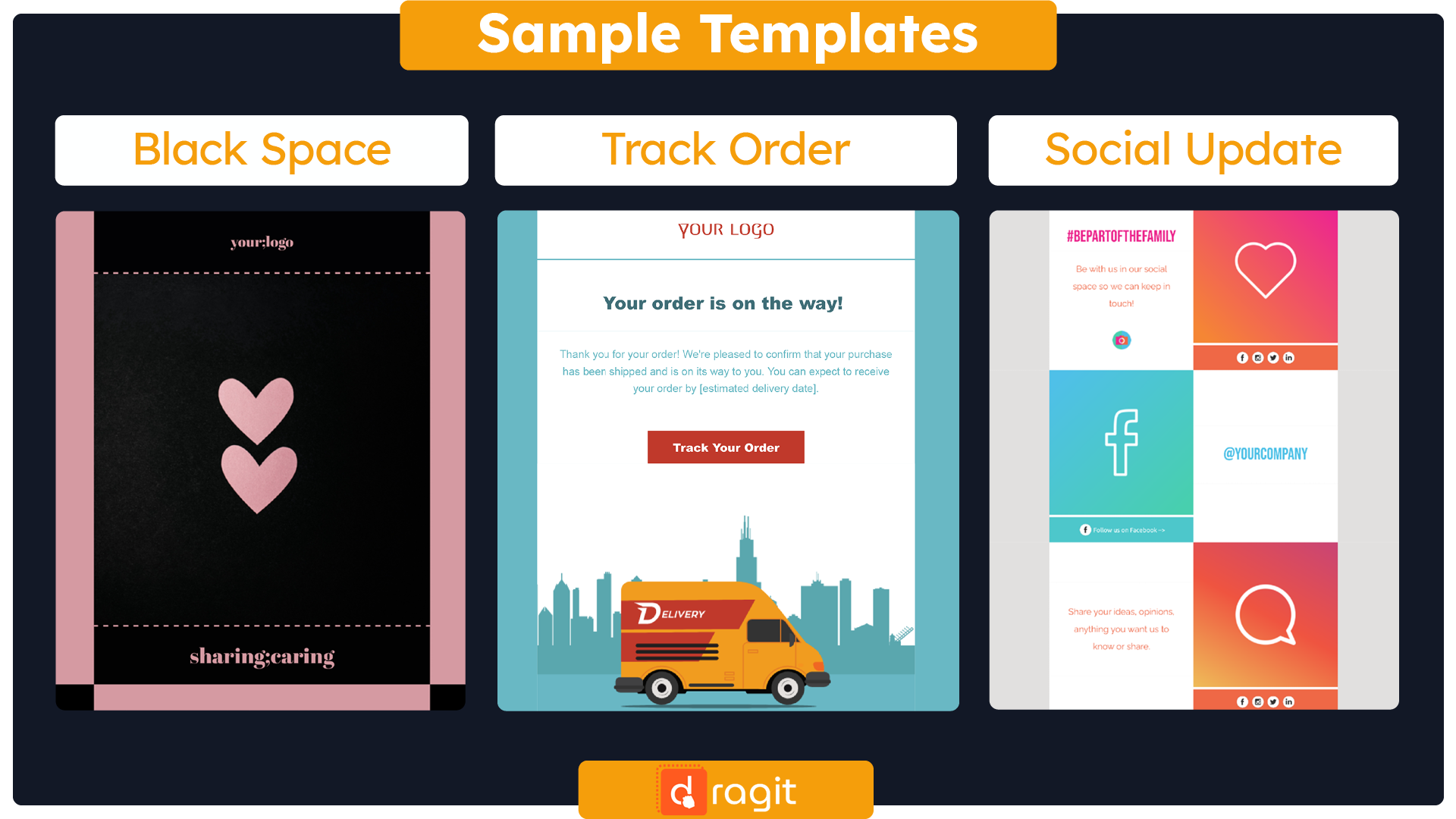
Get This FREE Black Space Email Template Here : Template
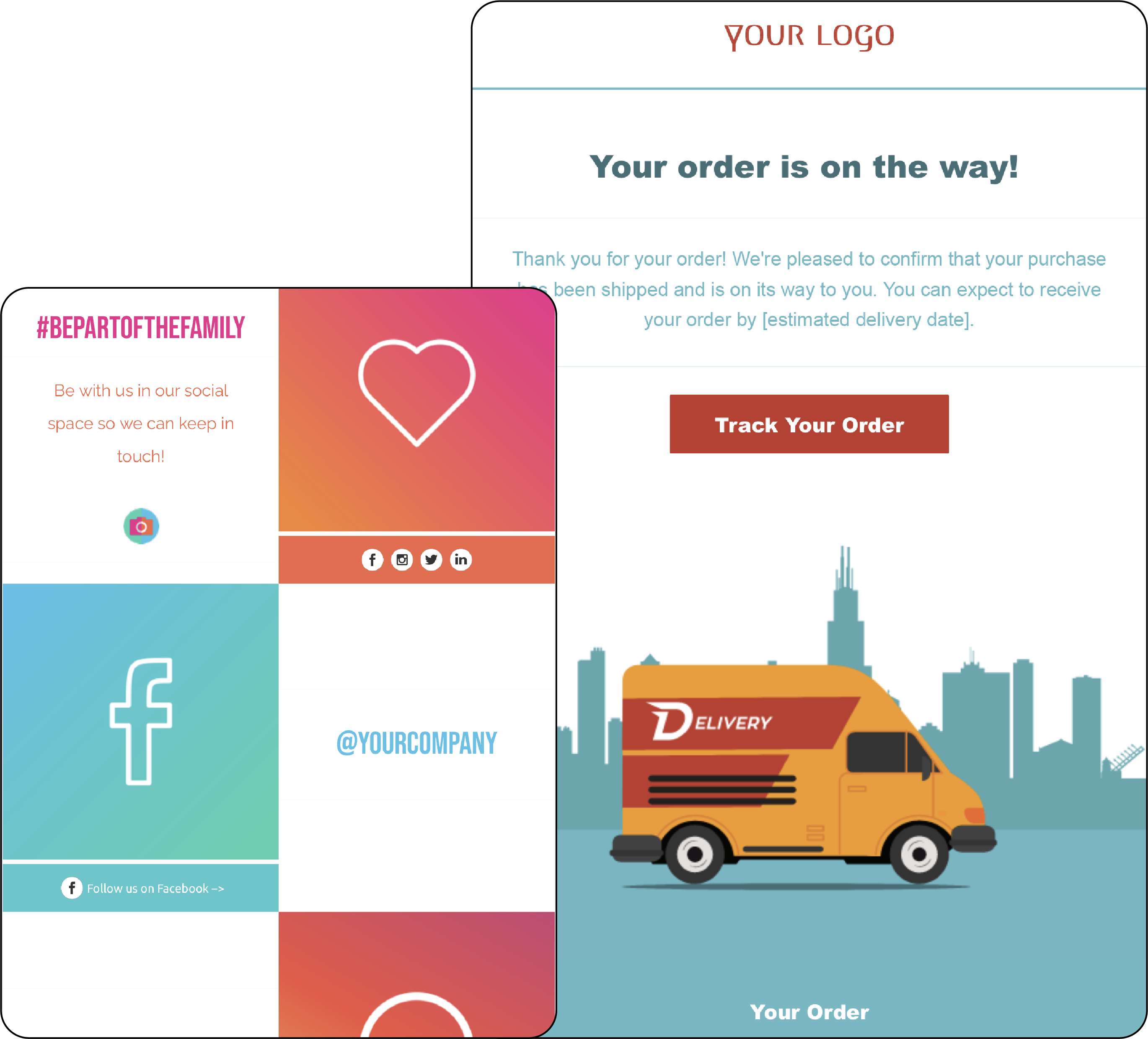
Get This PRO* Track Order Email Template Here : Template
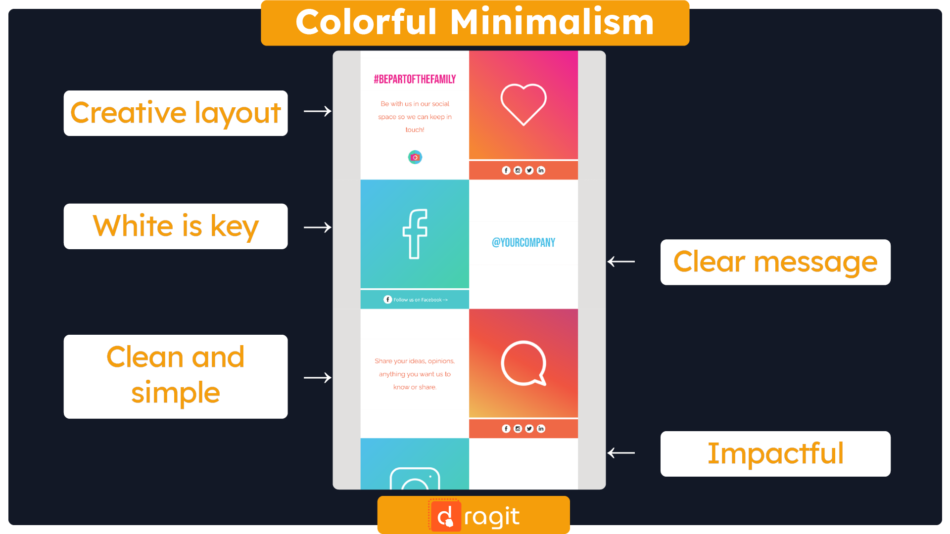
Get This PRO* Social Update Email Template Here : Template
*FREE for Dragit Pro Users.
Tips for Effective Email with White Space
This section will share some valuable tips for effective emails emphasizing white space. From keeping it simple by using contrasting colors, balancing white space with other design elements, and prioritizing content, we've got you covered. By the end of this section, you'll have a range of practical tips to help you create compelling email templates that incorporate white space in all the right ways. Let's dive in and explore designing emails that engage and inspire!
- Keep it Simple: White space is most effective when it's not competing with too many design elements. So, it's essential to keep the design simple and avoid clutter. This will allow the white space to do its job effectively, drawing attention to the most critical elements of the email.
- Use Contrasting Colors: Contrasting colors can help the white space stand out and make the email more visually appealing. By using contrasting colors, designers can create a more engaging design that draws the recipient's attention to the critical elements of the email.
- Balance the White Space: It's essential to balance white space and other design elements, such as text and images. Too much white space can make the email feel empty, while too little can make it cluttered. By finding the right balance, designers can create a cohesive design that effectively conveys the message to the recipient.
- Prioritize the Content: Prioritize the Content: When designing an email with white space, it's essential to prioritize the content. Place the most critical information at the top of the email and use white space to draw attention to it. This will ensure that the recipient sees the most crucial information first, increasing the chances of engagement and conversion.
- Test the Design: Before sending out the email, it's essential to test the design to ensure its effectiveness. This can involve A/B testing different designs to see which one performs better. By pushing the design, designers can ensure that the white space is effectively drawing attention to the critical elements of the email and that the email is achieving its intended goal.
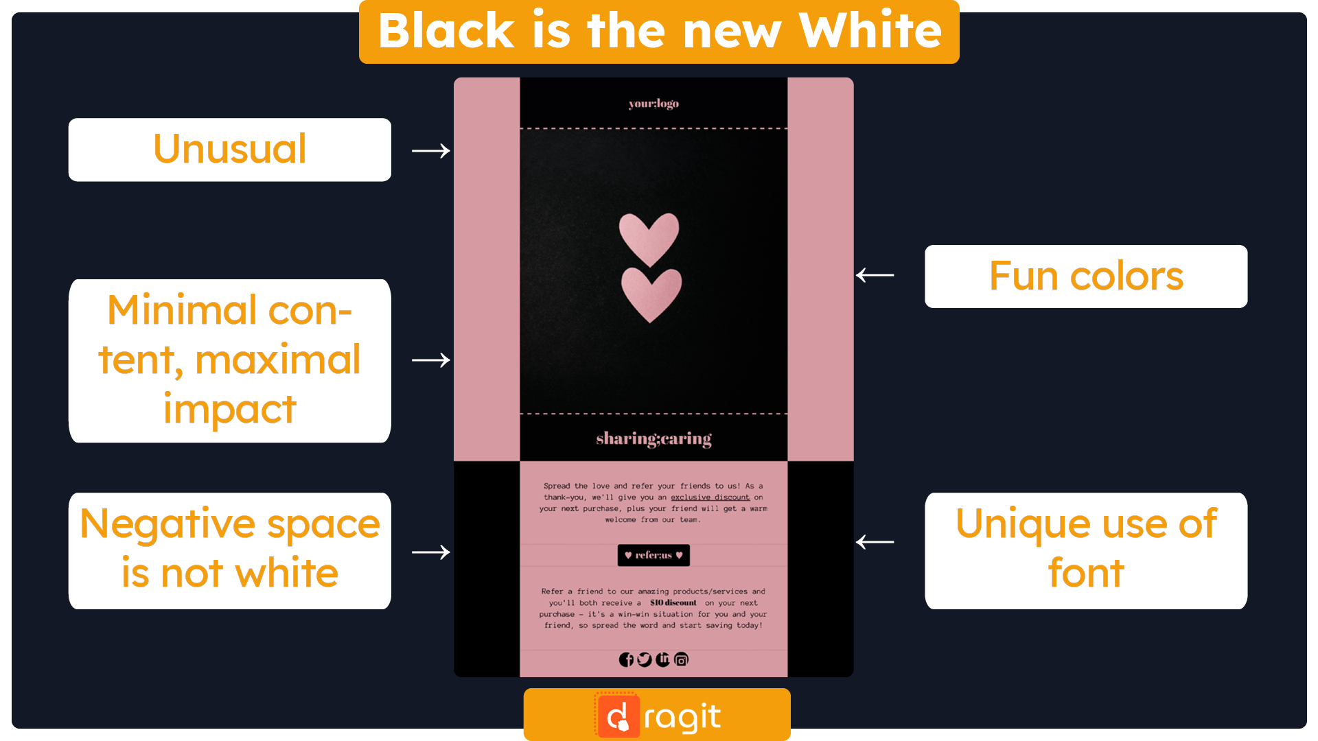
!TIPS AND TRICKS!: Did you know that white space doesn't necessarily have to be white? White space, also known as negative space, refers to the area around the content in your email that is left intentionally blank. However, it doesn't have to be white. In fact, it can be any color that complements your brand or the overall theme of your email. You can create a more visually appealing and cohesive design by strategically using color in your white space. For example, if your brand's color palette consists of blues and greens, you could use a light shade of blue or green for your white space to tie everything together.
When Tips Meet Practice: Designing Email Template with White Space Focus
Now that we've covered the importance of white space in email design and provided tips on effectively using it let's put these concepts into practice. When designing an email template, it's essential to consider the balance between design elements and white space. Incorporating white space into your email design can make it easier for the recipient to read and understand your message. White space can also improve engagement and conversion rates by drawing attention to the most crucial content and creating a sense of urgency. This section will explore how to design an email template with a white space focus, including tips on layout, typography, color, and responsive design. By the end of this article, you'll have a better understanding of how to effectively use white space in your email design and be able to put these concepts into practice.
- Streamlined Layout: Feel free to experiment with different layouts when designing your email template. Use white space to create a clear visual hierarchy and experiment with different ways to balance images and text. You might be surprised at how small changes to the layout can improve engagement and conversion rates.
- Enticing Pre-header: The pre-header is the short summary text that appears after or next to the subject line in the email preview. Use white space in the pre-header to make it stand out and provide additional context for the email's content.
- Experimental Typography: Experiment with different fonts and font sizes to create a visually exciting email design that draws the recipient's attention to the most important content. Use white space to separate the different text elements.
- Balanced Colour: Incorporate color in your email design to add visual interest and reinforce your brand identity. Use white space to balance the colors and avoid overwhelming the recipient with too many colors.
- Cohesive Design: When designing an email template, it's essential to consider the balance between design elements and white space. Avoid overcrowding the email with too many design elements and use white space strategically to create a clean, uncluttered design that is easy to read and understand.
- Meaningful Content: When designing an email, prioritize the most crucial content by placing it at the top. Use white space to highlight this content and make it stand out. This ensures the recipient understands the email's purpose and can quickly act.
- Clear Call-to-action: Include a clear call-to-action in the email and use white space to draw attention to it. A clear call-to-action makes it easier for the recipient to understand what action they need to take, increasing the likelihood of conversion.
- Optimized Responsivity: Make sure your email template is optimized for responsivity so it can be viewed easily on different devices. Test your design on various devices, and use white space to optimize the layout for each screen size.
- Sense of Urgency: By strategically using white space, you can create a sense of urgency and encourage the recipient to take immediate action. For example, use white space to highlight a limited-time offer or a flash sale.
- Underlined Branding: Incorporate white space into your email design to create a sense of branding and help the recipient identify your brand. Use white space to highlight your brand's colors, logo, or other visual elements that are unique to your brand.
Summary
Thanks for reading through to the end of this article on the role of white space in email design! We hope you've learned a lot about how white space can be used to improve the effectiveness of your emails. By incorporating white space into your email design, you can create a more visually appealing, easier-to-read email that drives more engagement and conversions. Remember to keep your layout simple, use contrast to highlight critical elements, prioritize content and include a clear call-to-action. And don't forget to use white space to balance text and images, create a clear hierarchy, and avoid overcrowding. With these tips, you can design beautiful, practical emails that engage your audience and drive results.


