Are you lost in the swarm of questions running through your head? What is a newsletter email? How to create a customised newsletter template? What are the best ways to create the right email to attract new people and drive sales? Creating the ideal newsletter template precisely for your needs is not easy. Creating great newsletters that will engage your clients and convert and represent your company's activities and spirit is a great deal. But don’t worry! In this article, we will be happy to guide you through the process of conceiving and preparation of such converting newsletters step by step from the complete beginning to the designer’s icing on the cake. You can always refer to our Dragit Free newsletter templates for inspiration!
What exactly is the newsletter?
As we already mentioned in our previous article "8 types of emails to boost your sales”, a newsletter is a regularly sent e-mail that informs your clients about all the latest news in your company.
Why shall your regular newsletter become a well-thought-out converting tool?
Before we dive in, ask yourself the following questions. Does your company send a newsletter? Why did you decide to send it or learn more about sending it? What do you expect from the newsletter? What comes to mind when you hear the words ‘converting newsletter’?
Although it may seem that the newsletter is a simple news communication email, the fact that it is one of the most used marketing tools is not just a coincidence! There is more to it than just a monthly batch of news that are being sent as a form of habit. Because what we all want is not just an ordinary batch of information, but a converting newsletter that will bear you the juicy fruit in the form of clicks and sales! We are here, not in order to to help you to fix what is not broken; we are here to help you polish your newsletter to the converting rare diamond of your company.
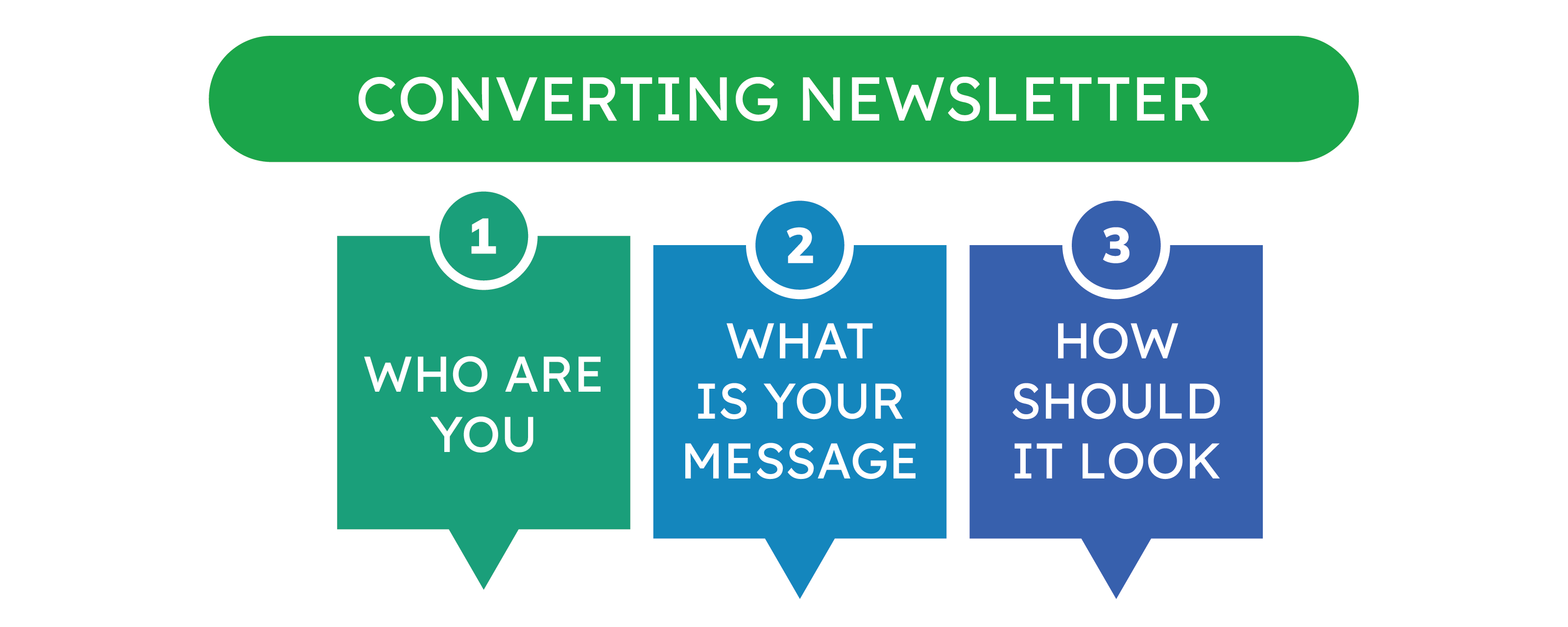
Therefore, for your newsletter email to convert and succeed, you need to build good foundations through consistent branding, clear and exciting content, and refined and engaging design. We have summarised this for you in the following "3 pillars of a successful converting newsletter”:
- WHO ARE YOU, or What is branding, and how important is it when creating a newsletter?
- WHAT IS YOUR MESSAGE, or How do you properly communicate your ideas and sell your brand?
- HOW SHOULD IT LOOK, or How best to conceive the layout and design for a winning newsletter email?
1.WHO ARE YOU, or What is branding, and how important is it when creating a newsletter?
The newsletter communicates information about your company to your clients. That is why it is essential to know yourself, what your company is and what image of your company you have in mind. That is where branding comes in place. While branding is a broad and complex topic by itself, we will outline the essential knowledge, you need for newsletter creation, in this article below.
So what is "branding"? The word branding is derived from the English word “brand”. While from most of the definitions, of the words Brand/Branding you may conclude that it is only the visual representation of your company like logo or color palette, in reality it is not quite true. In the modern world Branding includes in itself way more then just that - it is everything from the logo of your company, brand color palette, communication tone and language choice, to the product itself, your values, your employees, your clients. It is all the aspects related to your company, that create the image and ambiance of your company - and your goal is to make this image the most positive and beneficial for you. Branding is everything you use to build awareness and a good reputation among clients.
Why is branding so important when creating converting newsletters? You can say, that branding is not only important, but is actually the first foundation brick of any successful email communication. Because in order to establish a proper communication with your clients, you first need to know who you are and what you have to offer to them. Create a so-called proper introduction of yourself, your communication persona. Similarly, as you can never sell a product that you have never seen or tried, you cannot create a dialogue without proper introduction of yourself to the client. You have to know yourself and present yourself properly, to be able to sell yourself!
Cool! Now we know why we must maintain the branding in our email marketing. But how to do it and how to apply it? You will learn more about the application of branding in practice when creating newsletters in the following two pillars.
2.WHAT IS YOUR MESSAGE, or How do you properly communicate your ideas and sell your brand?
Newsletter content, that catches the eye of your clients
What shall be the content of your newsletter? First, you need to realize, why you are creating this newsletter and what you expect from this newsletter. While some companies may concentrate on their milestones and achievements, to show how their brand is growing and succeeding, others may long-term nurture sales prospects by sending valuable content, and others may share the latest events and conferences to bring people together and create a real life engagement with the brand. It would be best if you chose that specific thing ( or a mixture of things) that brings your company and clients the most value and hold on to it. As we have already mentioned, you need to understand who you are and most effectively present just that. Your content is the speech of your brand. So let's start your speech correctly, right from the start, from the first email that will end up in your clients' inbox.
Subject line and a preheader
The subject of the email is the first thing the recipient of the email will see, and it is necessary to describe your wonderful newsletter as best as possible in its short length (1-7 words) and thus ensure that the client opens it.
Below you can see the study conducted by Marketo on the engagement rate analysis of the subject lines of various lengths. Based on the data, the most ideal scenario for you is to land as close as possible to 7, but not to exceed it:
As for the characters count, Marketo study states, that around 41 characters shall be an ideal subject line for you. But since on the mobile, only a shorter version of the subject line is visible, place your most important information in the first 30.
The pre-header is the text immediately below the subject line in your email preview. It is usually 40-130 characters long. In the preheater, you can include a catchy question, intriguing fact or a brief intro to your email. Together with the subject, pre-header determines whether the client will read your email or not! They are first things the client sees and therefore should be the first thing you focus on!
So now, when you already thought about branding and established your communication persona, area of concentration, the subject line and pre-header caught an eye of your clients, you need to concentrate on the creation of the newsletter content itself.
Keep in mind the four goals of a successful newsletter content. A converting newsletter needs to be:
a) Consistent
Keep a consistent email topic, structure, and other main elements (contact, social media, etc.). It will help your clients to know what to expect. It will also speed up the clients' orientation in the content and thus finding what they are interested in faster, leading to higher engagement and faster potential clicks and purchases.
Don't forget about branding! Support a constant brand image of who you are and how you present yourself. Clients like new, tempting, and exciting things but also love comfort and constants that don't change. Underline their feeling of comfort and show that they can rely on you.
b) Targeted
Segment your audience to have the most personalised client groups possible. Then select a content for each specific group, based on their interests and engagement. This will help you to create emails and newsletter email templates that are as specific and interesting as possible to that group, and thus most likely to engage them!
C) Eye catching
Distinctive header, interesting slogan, catchy headlines!
No need for a bunch of complex sentences. Time is money and every second counts, help the clients get everything done, don't bore them and you're halfway there! Get straight to the point, but give a structure to everything.
For example, engage them with articles summarizing your achievements ("We have reached a new milestone in the field of sustainability!"), or entice them with interesting events ("Come and see our first fashion show on the Vltava river!").
D) Useful
Make the best of the time you have with your clients by sharing truly useful and valuable information with them.
End each section of the newsletter with a direct call to action, the next step you want your subscribers to take. Help them get involved in the event you're writing about, or find out more about your contributions to the society, or, perhaps most importantly, encourage them to buy!
Also, give your clients the opportunity to have useful information and elements, that will make your interactions easier, handy. If clients want to further learn about you or have questions, provide them with your contact information and social networks, where they can do it.
Newsletter Timing
Getting the timing right is half of the newsletter's success! Well, maybe not half, but it's a significant aspect, that will help your newsletter get into the hands and minds of as many clients as possible!
What are some main tips to keep in mind? Send newsletter emails during the day rather than at night (It's better to send them when people are awake, right?). Send newsletter emails on days other than Mondays and weekends. On Monday, everyone is going crazy, and on weekends we usually want to relax and often don't even look at the emails. So what are the best days for sending your newsletters? People have the most time for such things on Tuesday, Wednesday, and Thursday, in the middle of the week. When it comes to Friday, we usually already look forward to the weekend!
You may ask: "Can I send a newsletter other times, than what you recommend here?" Am I making a mistake?". The answer is yes and no. Of course, following best practices is always helpful, but as with everything else, you need to be aware of your audience and target groups and do your research. What worked for companies before you may work the complete opposite for you!
3.HOW SHOULD IT LOOK, or How best to conceive the layout and design for a winning newsletter email?
Newsletter layout responsiveness
How to start designing a newsletter? It is necessary to realize what layout you want. There are many types of layouts and their reactivity/adaptability, from purely static, where everything is set in one size that does not adjust in any way, to, which is now almost considered the norm, responsive one, where the layout is set to adjust to different resolutions on various devices from desktop to mobile phone. Did you know that US website traffic in 2020 was made up of 61% mobile phone traffic and global website traffic made up of 68% mobile traffic! (source: perficient.com) This is just more proof that mobile-first responsiveness is the way to go!
If you are using Dragit email builder, the system makes sure for you, that your email templates are fully responsive, not only to mobile, but also to tablet view. You can even use a quick preview how it will show up on different devices , before exporting you emails! Try using it yourself below!
Try Discover the World - Free Newsletter Template HERE .
Color scheme
For most of us, colors are one of the main aspects of the perception of the world, including the digital world. Color can evoke certain emotions, concentrate attention on a given part, highlight a call-to-action button, and simplify our orientation. By now, you most likely have already created your Brand color palette, which you are using on your website and other company resources. Your email marketing shall not be an exception. Color up your newsletter in your brand style!
If you are just getting started with your Branding and Brand colors, or if you are looking for new ideas or don't know how to perceive colors, the entire internet is here for you in the palm of your hand! You can take a look at color theory and learn how to use color schemes that complement each other, whether it's by using one color in many tones (monochromatic scheme), choosing adjacent colors on the color wheel (analogous scheme), or using opposite colors (complementary scheme). An excellent source, we love using at Dragit, for choosing awesome color combinations, that we would like to recommend you is Free Color palette generator from ColorSpace.
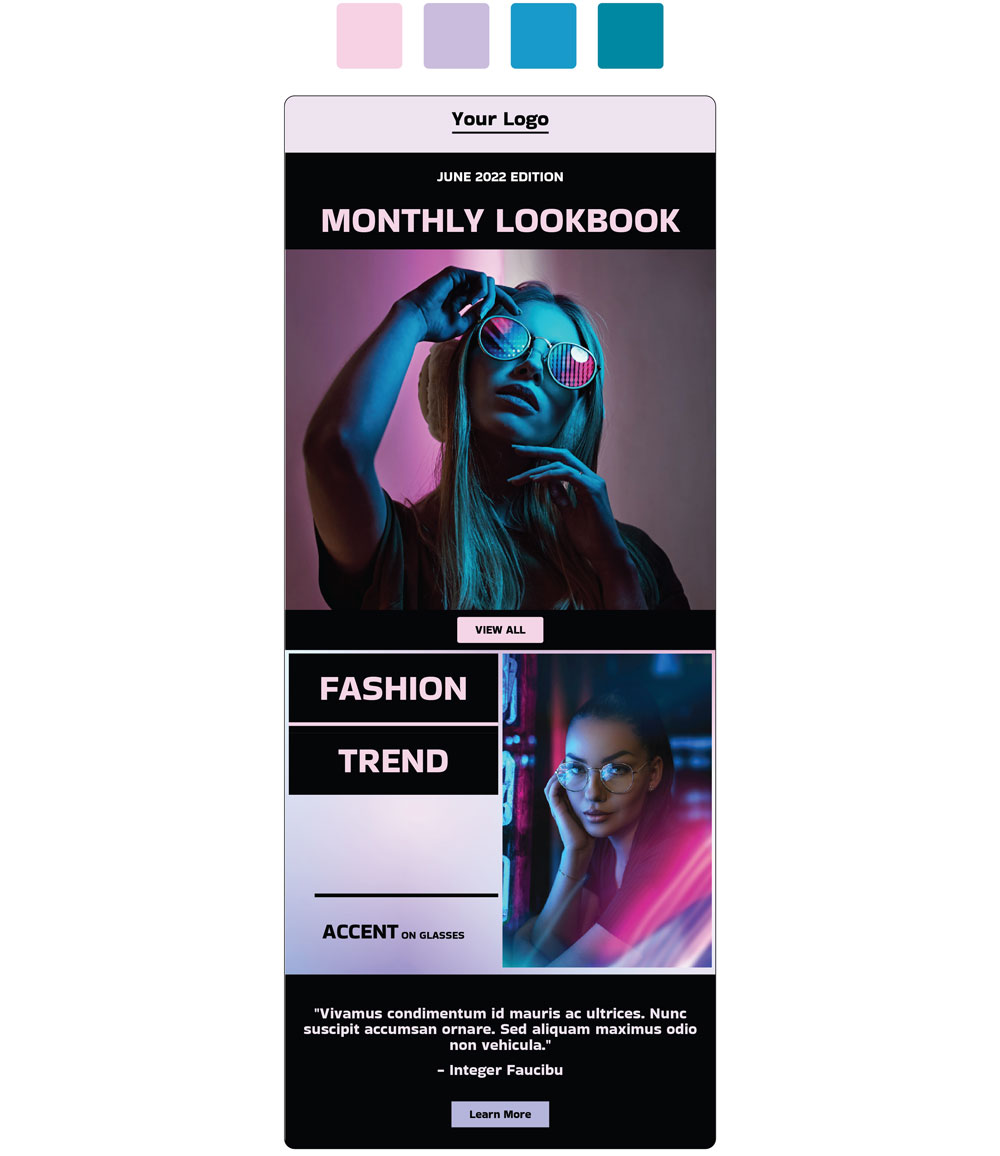
Check out for the inspiration the PRO template we have created using Dragit and Color Palette below.
Get PRO Fashion - PRO Newsletter Template HERE . FREE for Dragit Pro Users.
!TIPS AND TRIKS!: It is very important for designers to choose colors that complement each other, but we must not forget that it is even more important to choose colors that are easy to read and help with the clarity, not the other way around! Therefore, when designing, don't forget that the essence is that your newsletter is clear and readable, everything else is secondary! If you came up with a white text on soft yellow background, better forget it!
Newsletter header
The first element you will put in your newsletter would be the header. A newsletter header always contains a company logo and may also include a slogan, date, or even a navigation menu bar with the most important links for your brand. You can find the header at the very top of the email.
Newsletter Body
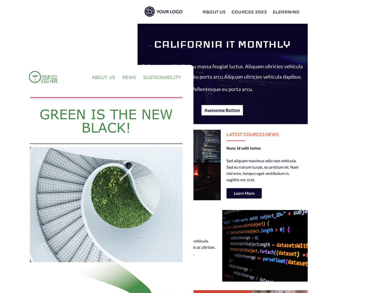
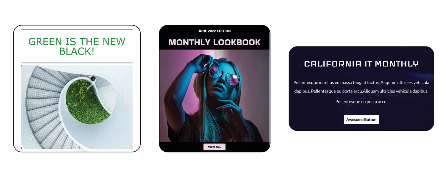
The introductory block of the Newsletter is the first content Block from the email body you will put in your email. This block usually contains a welcome text or the main message from your company to the reader, that is followed by a Call-to-action button and design piece (photo or vector image). This block is your first impression from the email and thus always shall be well-thought-out and carefully designed. Be clear and concise in the message you send. And surely, don’t forget about branding! This block determines if the reader would proceed with reading your newsletter email or not. Below you can see some examples of the introductory blocks:
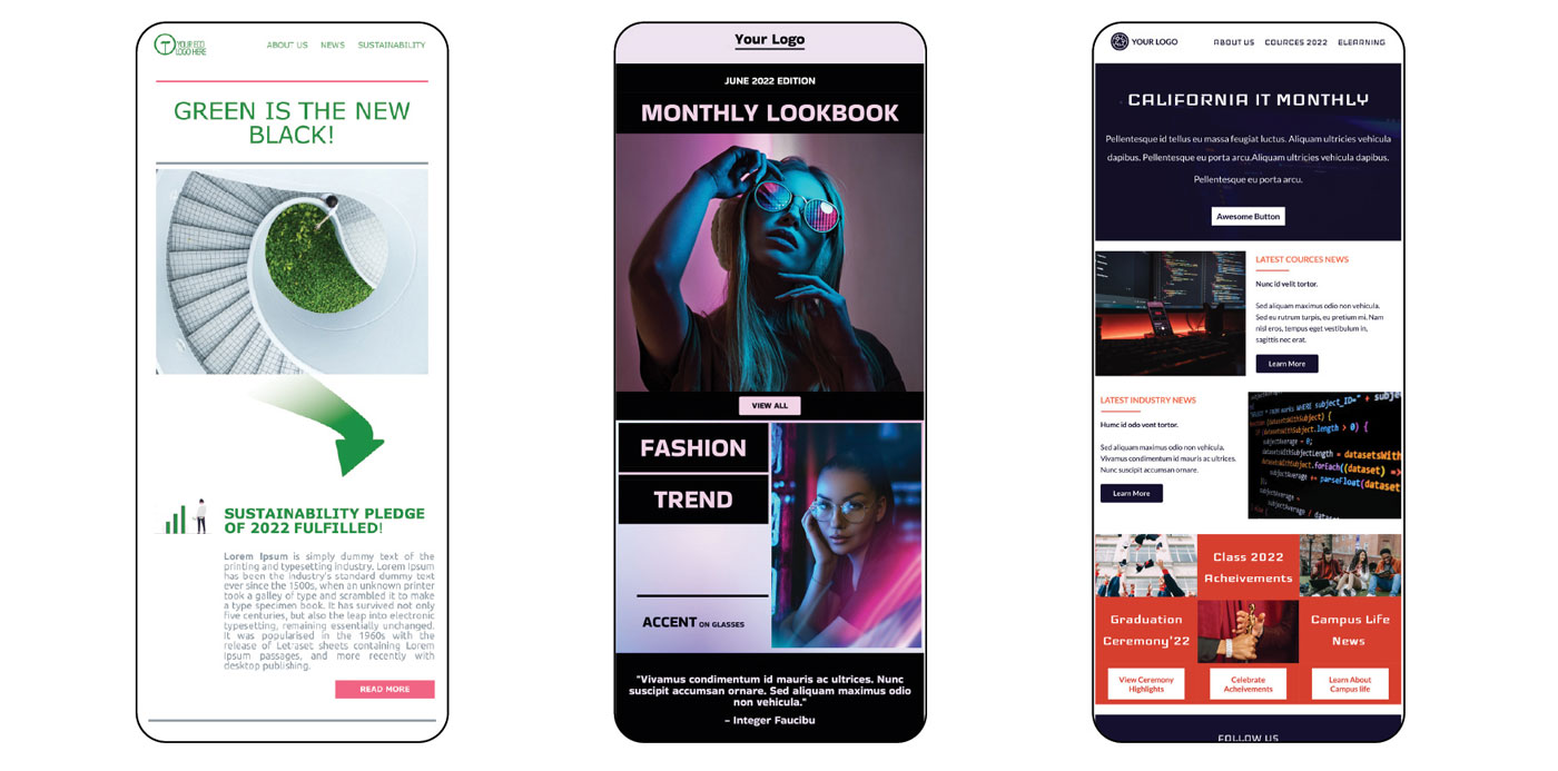
And this is how they look like as parts of templates:
You can try them out yourself!
- Try Green is the New Black - Free Newsletter Template HERE .
- Get PRO Fashion - PRO Newsletter Template HERE . FREE for Dragit Pro Users.
- Try IT FREE - FREE Newsletter Template HERE .
You shall organize the main content of the newsletter in clearly separated blocks containing news, articles, events etc. In Dragit, you can create countless sections with separations up to 4 columns, giving your imagination room for limitless creativity. Don't hesitate and jump in, don't forget the hottest news, and give them the most space! (E.g. "We opened our first showroom right in PRAGUE!").
Your newsletter should not be done as only plain organized text. It shall also contain visually appealing aspects, such as thematic images related to each article or design vector elements. You can also spice text up by introducing significantly different headlines in size and/or color from the regular text. It is done to catch the interest and help the reader, by helping him move pleasantly through the newsletter's content.
And finally, we must not forget to include call-to-action buttons in the newsletter! We are happy that the client opened our newsletter, even happier that he looked at it or read it, but we are the happiest, when we get the client from the e-mail newsletter to us, whether it helps us to strengthen our relationship (the client learns more about of the company, e.g., its charitable and environmental milestones, and has the opportunity to grow closer to his heart) or helps us make the desired deal!
Things to remember in the newsletter
There are some other things that you might consider putting in every newsletter (and not only there) that will help you build reputation and trust:
Company’s history. People value a long history and will trust your company even more. If you are a long-term established company, you may include some facts from your past in your newsletter. It will be interesting for the clients to read and will boost your trust.
Client’s testimonials. Your clients may be happy to see testimonials, i.e., feedback from other clients who are satisfied with your products/services.
Social Networks. Your followers may be interested in learning more about your company and your team from the social networks. Converting your customers to followers will also boost your image and credibility on social networks.
To sum up
Newsletter emails are straightforward and efficient and are one of the best email campaign tools. They will help you, not only build your brand and brand awareness, but also convert your audience into long-term, loyal and informed clients. That's why we hope you will keep our main 3 pillars of a converting newsletter in mind.
First, you need to know who you are and focus on branding, both from the point of view of intangible aspects such as the personality and opinions that you want to present in your newsletter, as well as the tangible aspects such as your logo and color scheme that you want to reflect in your design. Then you have to realize, why you are sending the newsletter, what you are trying to convey with it (exciting things, events, etc.) and how you are trying to convey it (directly, punchily, etc.). And last but not least, how the newsletter should look, i.e., everything from the color of the header to the size of the social icons in the footer.
The world of email template design can be challenging to navigate at times, but it's much easier to start with a template that works, adjust it and make it your own than to start from scratch. That's why we have prepared sets of different email templates for free, not only for newsletters, which you can try HERE. But since we know that we also have some design connoisseurs here; we have just one final question for you…
