Have you ever opened an email and felt like it was missing that special something? The content may have been great, but the design left something to be desired. Or you found yourself scrolling through a wall of text, wondering when it would end. Well, fear not! There's a simple solution that can take your email campaigns from bland to brilliant: animated elements. Adding a little animation can go a long way in making your emails more engaging, memorable, and effective. Whether promoting a product, sharing news, or just connecting with your audience, animated elements can help you stand out in a crowded inbox and create a lasting impression on your readers. But how do you use animated features effectively? In this article, we'll explore all these questions and more, diving into the benefits, best practices, and theory behind using animated elements in email design. We'll also provide some FREE/PRO templates to test it and apply all tips and tricks for incorporating animation into your own email designs in practice. So sit back, grab a cup of coffee, and let's get animated!
Understanding Animated Elements in Email Design
Email marketing has become an essential tool for businesses of all sizes, with 93% of B2B marketers using email to distribute content. With such a high volume of emails being sent daily, making your emails stand out from the crowd is essential. One way to do this is by using animated elements in your email design.
Animated elements are graphics or text that move or change in some way, adding visual interest and engaging the reader. Various types of animated elements can be used in email design, including:
- Animated GIFs: Images that loop in sequence to create a simple animation.
- CSS animations: Animations created using CSS code that can be applied to text or graphics.
- Videos: Short video clips that can be embedded directly into an email or linked to a landing page.
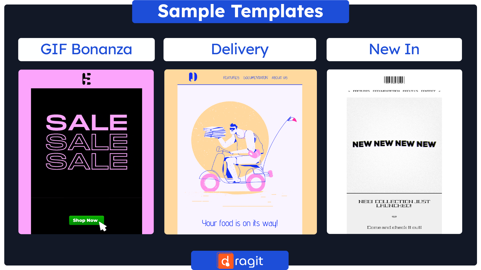
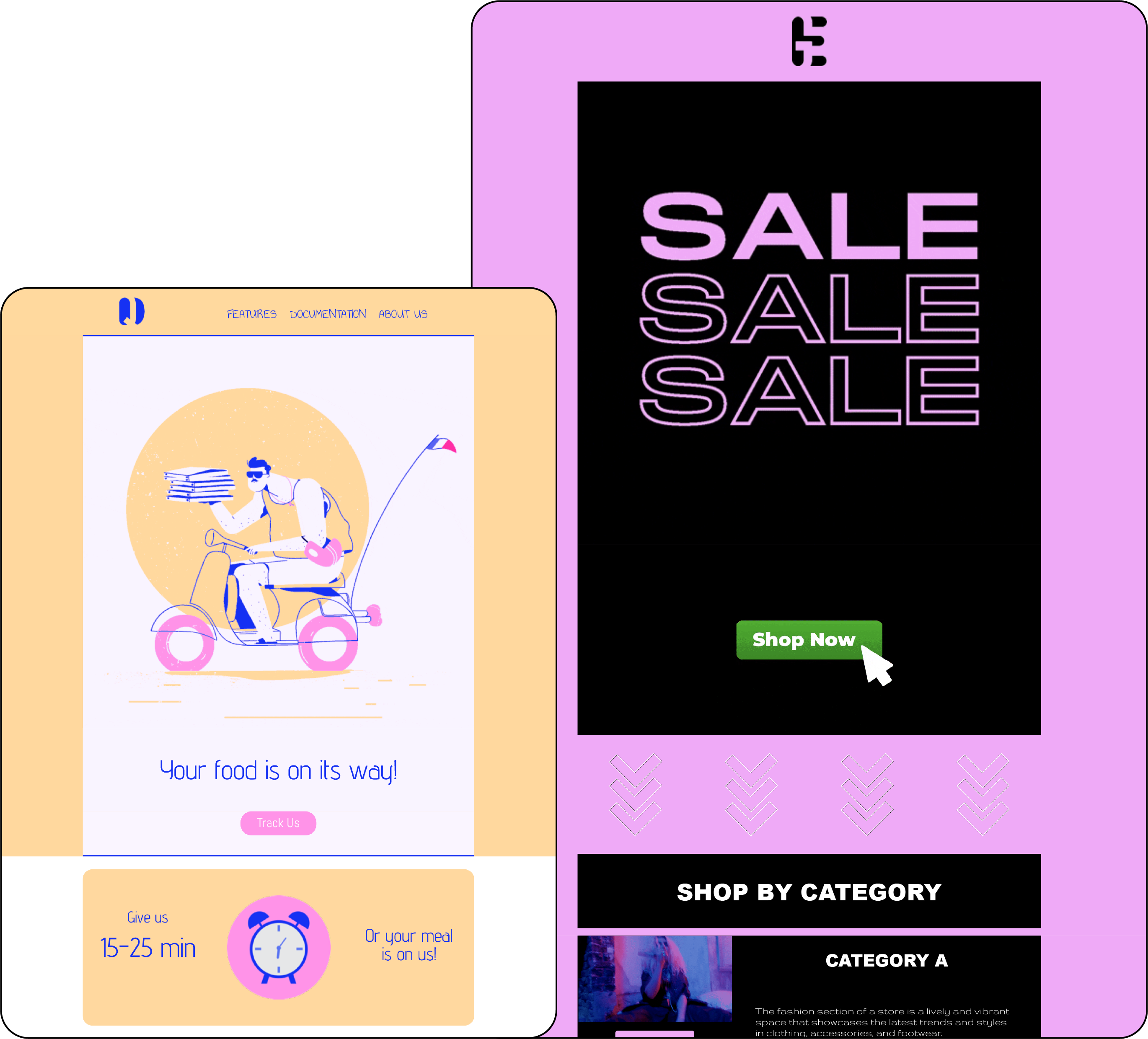
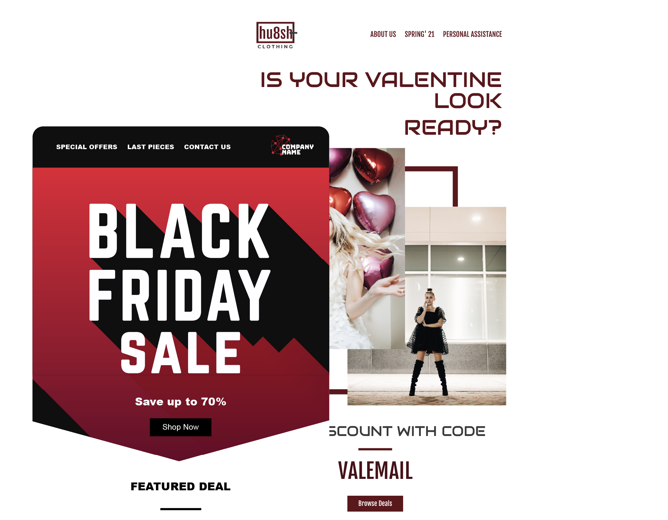
Get This FREE GIF Bonanza Email Template Here : Template
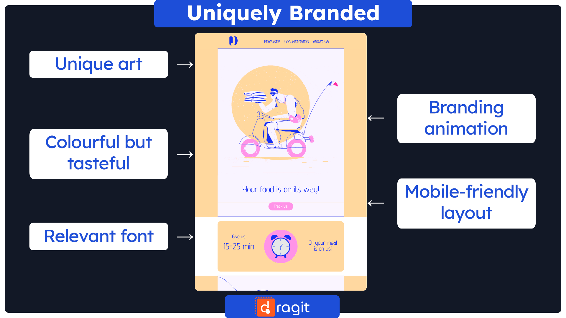
Get This PRO* Delivery Email Template Here : Template
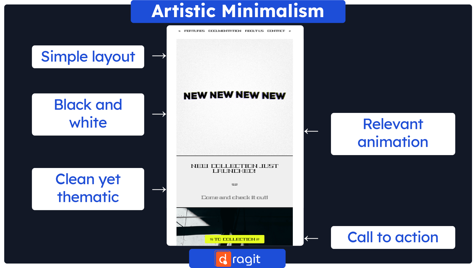
Get This PRO* New In Email Template Here : Template
*FREE for Dragit Pro Users.
Benefits of Using Animated Elements in Email Design
Using animated elements in email design can provide several benefits that can help improve engagement and drive results. In this section, we will explore some of the benefits of using animation in email design and provide examples of how they can be achieved.
1. Increase Engagement: Animated elements can capture the reader's attention and keep them engaged for extended periods, resulting in better click-through rates and improved conversion rates. Examples include:
- Animated call-to-action buttons that draw attention and encourage clicks
- Moving background images that create visual interest and maintain attention
- Animated progress bars show the reader how much of the email they have read, encouraging them to read more.
2. Better Storytelling: Animated elements can help tell a story more effectively than static design elements, making it easier for the reader to understand and relate to the content. Examples include:
- Animated infographics that show complex information simply and engagingly.
- Animated characters or illustrations that create a narrative and add personality to your brand.
- Animated transitions between sections of an email create a seamless and cohesive story.
3. Improved Brand Awareness: Animated elements can make your brand more memorable and stand out from competitors. Examples include:
- Animated logos or brand elements add a dynamic and modern feel to your brand.
- Animated product demonstrations that show your brand in action and highlight its unique features.
- Animated color transitions that create a visual signature for your brand.
4. Increased Accessibility: Animated elements can improve the accessibility of your emails by providing visual cues for those who may have difficulty with text-heavy content. Examples include:
- Animated descriptions or captions for videos that provide context for those who cannot hear the audio.
- Animated icons or symbols provide visual cues for those who cannot read the text.
- Animated progress bars or timelines show readers how much time is left before an offer expires.
Best Practices for Using Animated Elements in Email Design
While animated elements can be a powerful tool for improving engagement in email design, it is vital to use them strategically and effectively. This section will explore some best practices for using animated elements in email design to help you create compelling and engaging campaigns.
1. Keep it Simple: Regarding animation in email design, less is often more. It's best to keep animations simple and subtle to avoid overwhelming the reader. Examples include:
- Short animations that are at most 5-10 seconds in length.
- Simple, subtle animations that don't detract from the central message of the email.
- Use animation sparingly to avoid distracting the reader from the main content
2. Enhance, not Overpower: Animated elements should be used to enhance the message of your email, not distract from it. Using animation strategically to support the main message and create a more engaging experience for the reader is crucial. Examples include:
- Animated elements that draw attention to a call-to-action button or offer.
- Animations that highlight key benefits or features of a product or service.
- Animated transitions between sections create a seamless and engaging experience for the reader.
3. Optimize for Loading Speed: Animated elements can increase the loading time of your emails, potentially resulting in lower engagement rates. Optimizing your animated details for loading speed is essential to avoid delays in your email delivery. Examples include:
- Compressing GIF files to reduce their file size.
- Using CSS animations to reduce the file size of your email.
- Hosting videos on a third-party service to reduce the size of your email.
4. Test and Iterate: As with any marketing strategy, testing and iterating your animated email designs is vital to improving performance over time. Examples include:
- A/B testing different email designs to see which performs better.
- Analyzing engagement metrics to determine which animated elements are most effective.
- Iterating and optimizing your email designs based on performance data.
Building Blocks of a Successful Animated Email Design
This section will dive deeper into the main building blocks of successful animated email designs. Understanding these building blocks can help you create more effective and engaging email campaigns that drive results.
1. Call-to-Action: A strong call-to-action (CTA) is crucial for any email campaign; animated elements can help draw attention to it. Examples include:
- Animated buttons that change color or size on hover.
- Animated arrows pointing to the CTA button.
- Animated gifs that showcase the benefits of clicking the CTA.
2. Visual Hierarchy: Visual hierarchy is essential for guiding the reader's attention and creating a clear flow of information. Animated elements can reinforce visual hierarchy and enhance the reader's experience. Examples include:
- Animated transitions between sections create a seamless flow of information.
- Animated icons or illustrations that draw attention to crucial information.
- Animated graphs or charts that visualize data and statistics.
3. Personalization: Personalization can significantly increase the effectiveness of your email campaigns, and animated elements can help make personalization feel more natural and seamless. Examples include:
- Animated greetings that address the recipient by name.
- Animated product recommendations based on the recipient's purchase history or browsing behavior.
- Animated illustrations or icons that reflect the recipient's interests or preferences.
4. Interactivity: Interactive elements can help create a more engaging and memorable email experience, and animated features can help make these interactions feel more natural and intuitive. Examples include:
- Animated menus or navigation bars that respond to the recipient's mouse movements.
- Animated forms or quizzes that respond to the recipient's inputs.
- Animated buttons or sliders allow the recipient to control the animation or content of the email.
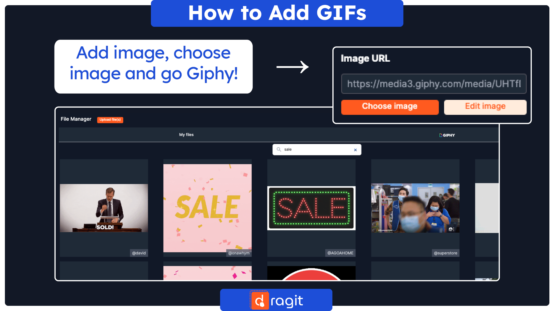
!TIPS AND TRICKS!: Are you looking to spice up your email campaigns with animated elements but unsure where to start? Look no further than email builders and editors! Many email editors offer integrated animated features like GIFs, making searching for and incorporating them into your emails accessible. And if you're looking for an email editor just like that, Dragit Email editor is a perfect choice. With its built-in Giphy integration, you can effortlessly search for and add fun and engaging GIFs to your emails without leaving the editor. So why wait? Give your email campaigns the extra oomph they need with animated elements, and let the Dragit Email editor help you take them to the next level.
Summary
So there you have it: a deep dive into the world of animated email design! We've covered a lot of ground, from the benefits of animation to the best practices for incorporating it into your emails. We've also shared some inspiring examples of animated email templates and explored the main building blocks of effective animation. Now, it's up to you to apply these insights to your email campaigns. Whether you're a seasoned marketer or a newbie to the email game, adding a bit of animation can help you stand out in a crowded inbox and create a lasting impression on your readers. So don't be afraid to experiment with animated elements like GIFs, videos, and illustrations, and remember to keep your audience in mind every step of the way. Above all, remember that email marketing is all about building relationships with your readers. Using animated elements in your email design can create a more engaging and memorable experience that will keep your readers coming back for more. So go forth, have fun, and let your creativity soar - the animated email world is yours to conquer!

