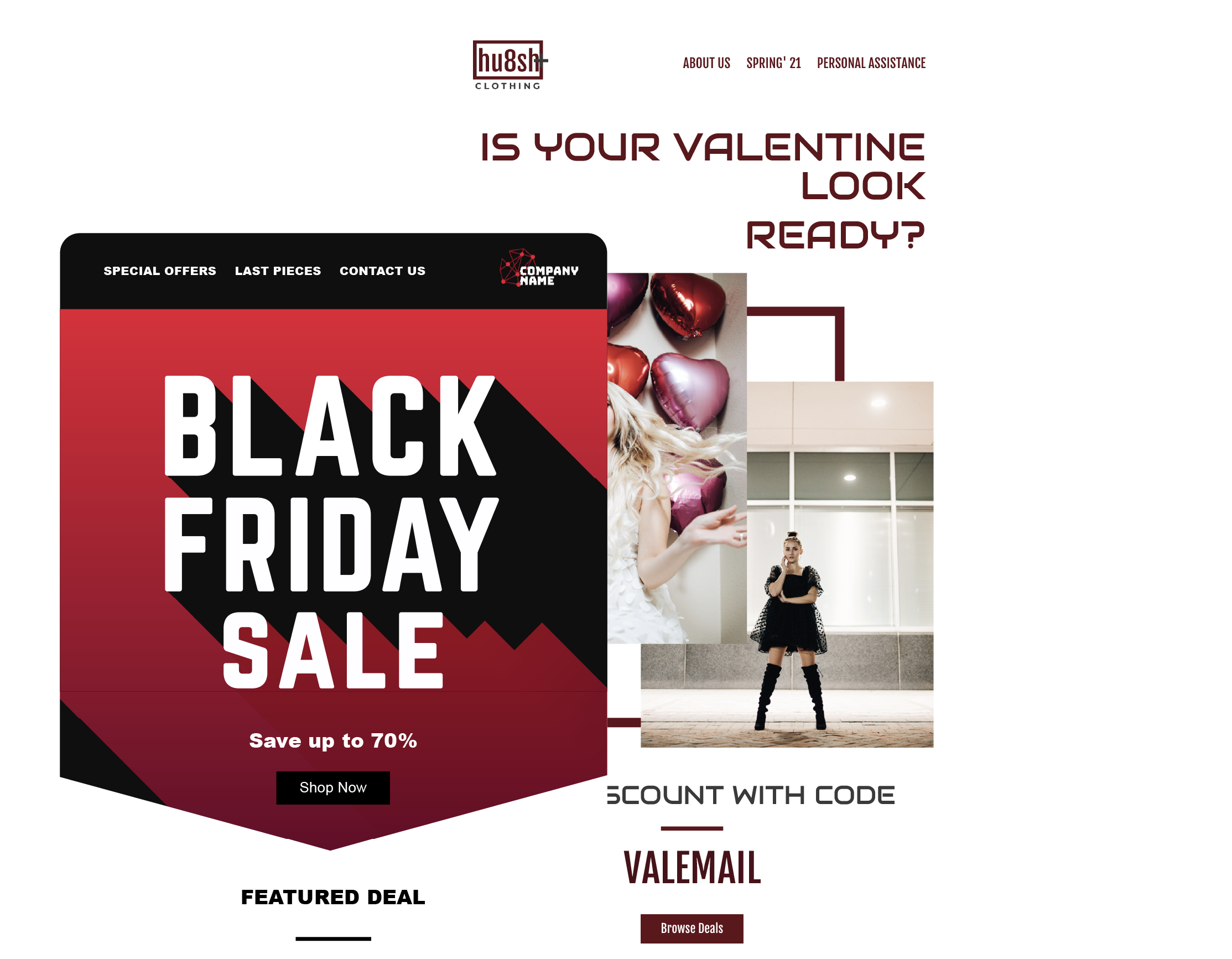
Are you tired of sending out emails that go unopened or unnoticed by your subscribers? Do you find yourself constantly trying to come up with new and innovative ways to grab their attention? If so, consider the benefits of simplicity and minimalism in email design. While it may seem counterintuitive, sometimes less really is more. In this article, we'll explore the advantages of a minimalist approach to email design and how it can help you create compelling and engaging emails that your subscribers want to read.
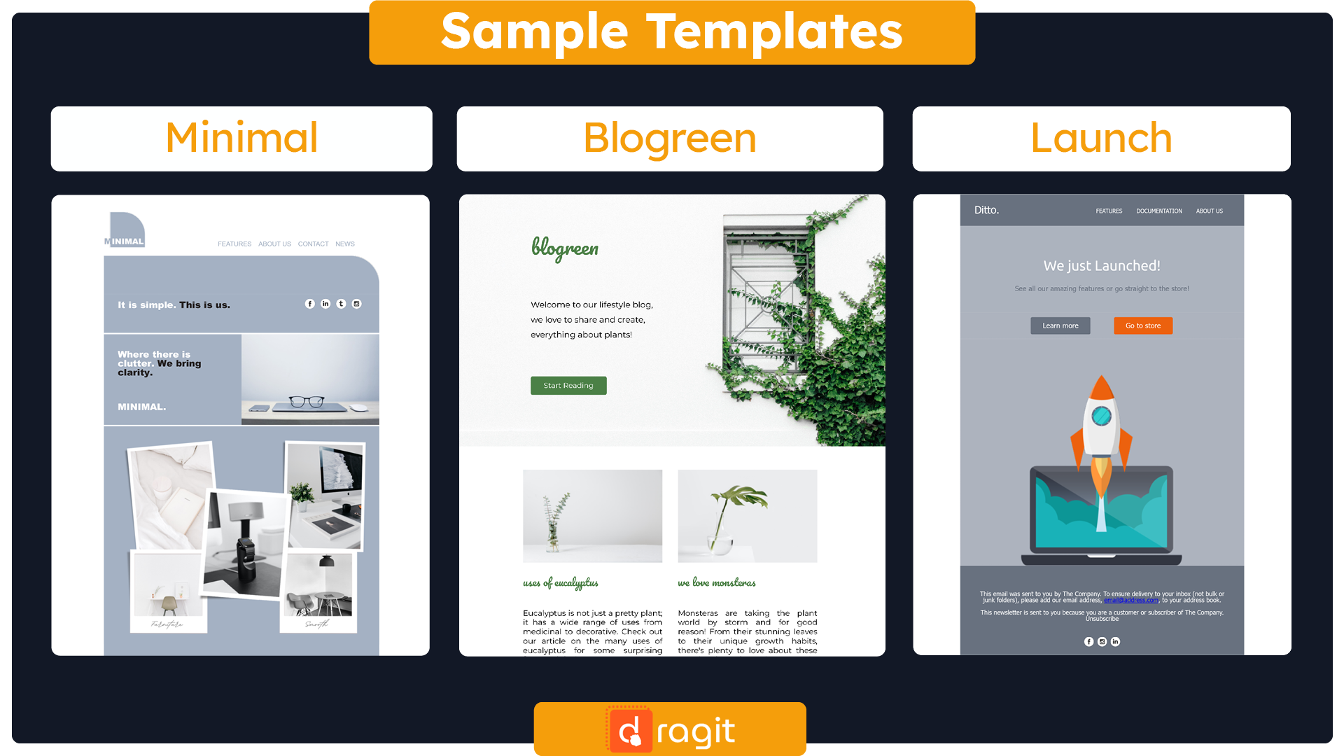
Get This FREE Minimal Email Template Here : Template
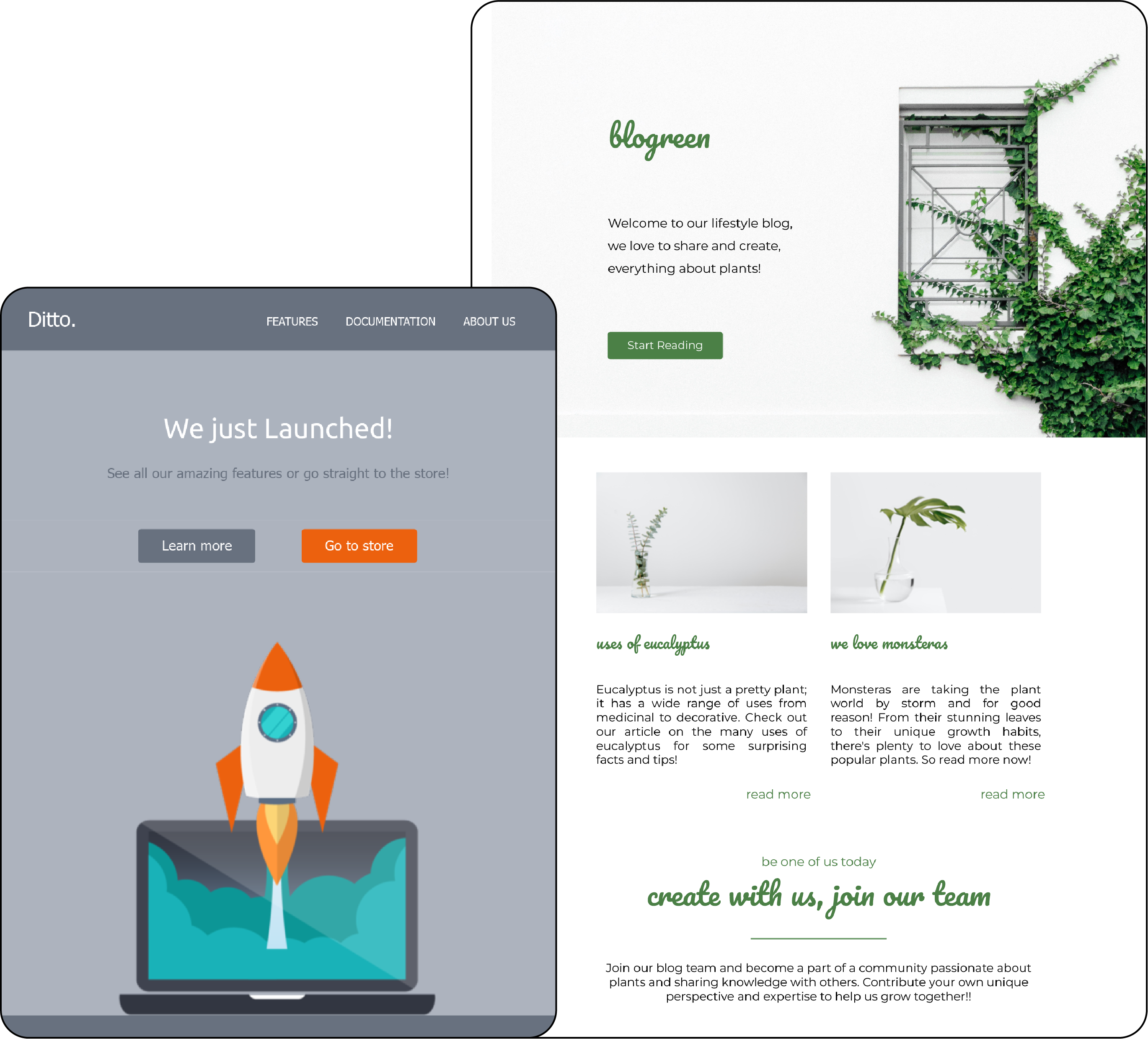
Get This FREE Blogreen Email Template Here : Template
Get This PRO* Launch Email Template Here : Template
*FREE for Dragit Pro Users.
Benefits of Minimalism in Email Design
Minimalism is the art of simplifying complex elements and distilling them down to their most basic forms. In email design, this means removing anything unnecessary and focusing on the essential components that will impact the reader. Here are some of the benefits of using minimalism in email design:
- Clearer messaging: Minimalism helps to eliminate clutter and distractions from an email, allowing the main message to stand out and be easily understood.
- Faster load times: With fewer design elements, an email using minimalism will have shorter load times, which is essential for engaging readers with limited attention spans.
- Better mobile optimization: Minimalist designs translate well to mobile devices, making them easier to read and interact with on small screens.
- Enhanced brand recognition: A minimalist email design can help to establish a strong brand identity and create a lasting impression on the reader.
- Increased readability: Minimalism encourages using easy-to-read fonts and colors, making emails more accessible to a broader audience.
By using minimalism in your email design, you can create visually stunning emails that effectively achieve your marketing goals.
8 Tips for Implementing Minimalism in Email Design
Are you ready to achieve a sleek and straightforward email design? When implementing minimalism, there are a few essential tips to remember. With the mantra of "less is more," these tips will help you create compelling, visually appealing emails that are easy to read. Here are 8 tips to help you get started:
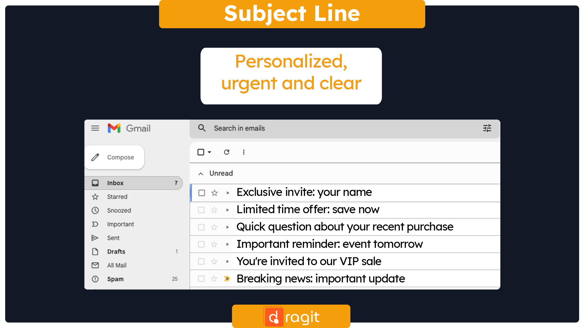
- Subject line: Keep your subject line simple and to the point, using no more than 5-7 words. Use a clear and descriptive message that quickly communicates the value of your email. Avoid using all caps, excessive punctuation, or spammy language (more on how to avoid spam filters HERE).
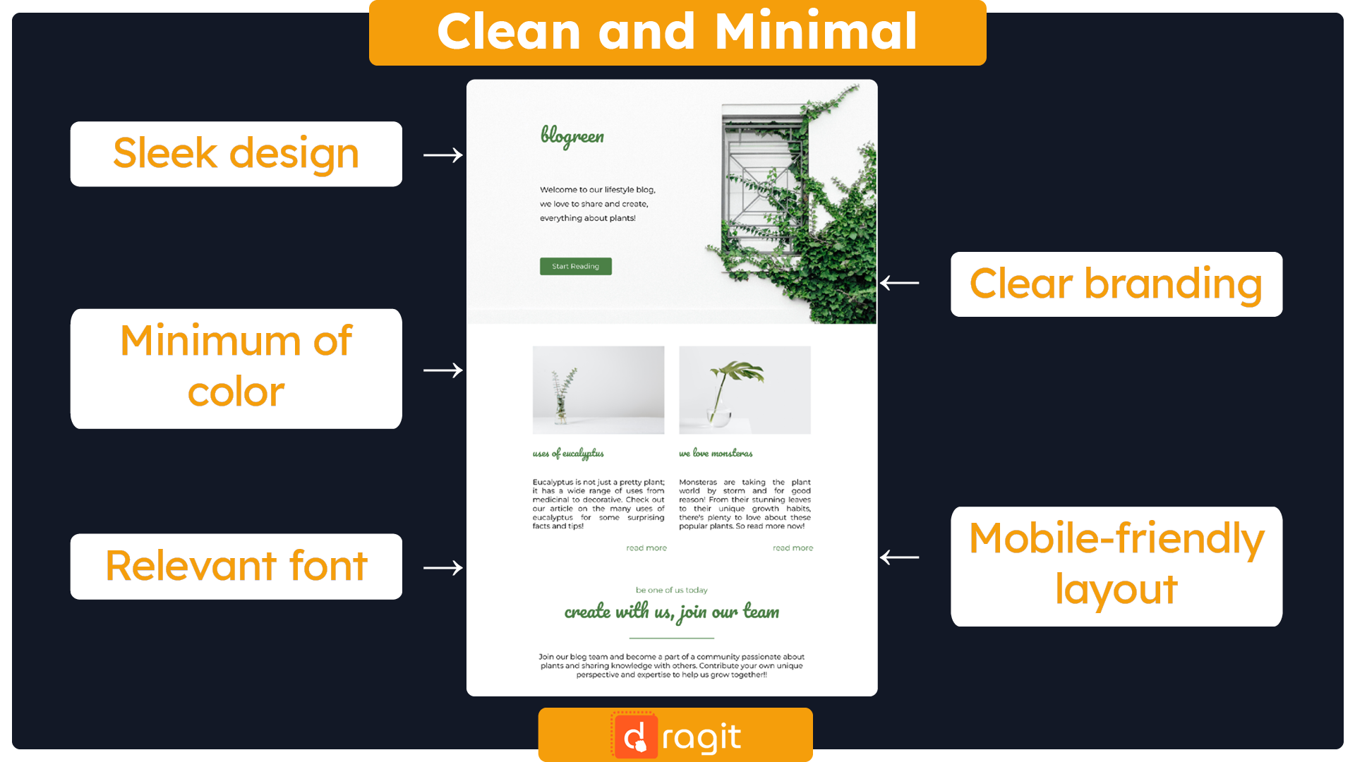
- Layout: When experimenting with different layouts, it's essential to remember that simplicity is vital. Avoid clutter and aim for a clear and straightforward design that helps guide the reader's eye toward the most critical elements, such as the call-to-action.
- Content: Keep it brief. Minimalism in email design often means keeping your message short and sweet. Focus on the most essential information and keep it concise.
- Color: Stick to a limited color palette. Using too many colors can overwhelm the viewer and detract from the message. Stick to a few complementary colors to keep things clean and cohesive.
- White space: Use plenty of white space. White space, also called negative space, is the empty space around design elements. It helps to create a sense of balance and clarity in your design and makes it easier for viewers to focus on the most essential aspects (more on how to use white space HERE).
- Fonts: Choose one or two easy-to-read fonts. Using too many different fonts or harder-to-read ones can make your email look cluttered and difficult to read. Stick to one or two fonts that are easy to read and match your brand's aesthetic.
- Graphics: Use simple graphics. Avoid cluttered or overly complicated graphics that can detract from your message. If you do use pictures, choose ones that are simple and high-quality.
- CTA: Your call-to-action (CTA) is the ultimate goal of your email, so it's crucial that it stands out and is easy to click. Use contrasting colors, larger fonts, and ample white space to draw the eye to your CTA, and make sure it's clickable on both desktop and mobile devices.
TIPS AND TRICKS!: Testing is an essential part of email design, and it's always a good idea to test your emails on various devices and email clients to ensure they display correctly. Test all elements of your email design, including subject lines and call-to-action buttons, and tweak as needed to achieve the desired results. Remember, the beauty of the design is in the eye of the beholder, so don't be afraid to experiment and test different variations to see what works best for your audience. Even the best-designed email can only fall flat if it displays improperly on the recipient's device.
With these 8 tips, you're well on your way to creating a clean, minimalistic email design that will make a great impression on your audience. Experiment with and test different layouts to see what works best for your brand and message.
Summary
In conclusion, minimalism is not just a design trend; it's a philosophy that can be applied to every aspect of our lives, including email design. We can achieve more effective and impactful communication with our audience by keeping things simple. Remember, less is more; sometimes, the most powerful messages come from straightforward designs. By embracing minimalism in your email design, you can create a memorable and engaging experience for your subscribers. So next time you design an email, remember these minimalism principles and watch your email campaign success soar.

