Introduction
Email marketing is a powerful tool for businesses to connect with their audience and drive conversions. However, emails need to have a user-friendly design to be effective and provide a seamless experience for recipients. This is where user experience (UX) in email design comes into play. By enhancing the UX of your emails, you can create engaging and impactful campaigns that resonate with your audience.
The Importance of User Experience in Email Design
UX as a Priceless Tool to Maximize Your Email Campaigns
User experience refers to a user's overall experience when interacting with a product or service. In email marketing, UX encompasses the design, layout, and functionality email recipients receive. A positive email UX can make a significant difference in how users engage with your emails and, ultimately, the success of your campaigns.
When it comes to email design, the goal is to create emails that are visually appealing, easy to read and navigate. A well-designed email should grab the reader's attention, guide them through the content, and encourage them to take action. By prioritizing UX in your email design, you can provide subscribers a seamless and enjoyable experience.
Best Practices for Enhancing Email UX
8 Tips for Optimizing the User Experience
To optimize the user experience in your email design, consider implementing the following best practices:
1. Design with Purpose
Every email you send should have a clear purpose and goal. Whether it's to promote a product, share valuable content, or provide essential updates, the design of your email should align with its purpose. Use a design that flows naturally from the intent of the email, ensuring that the objective is evident to the reader from the moment they open it.
Transactional emails, such as order confirmations or password resets, should be concise and to the point. Provide the necessary information and make it easily accessible. On the other hand, marketing emails should be visually appealing and enticing, capturing the reader's interest and encouraging them to click through to your website or landing page.
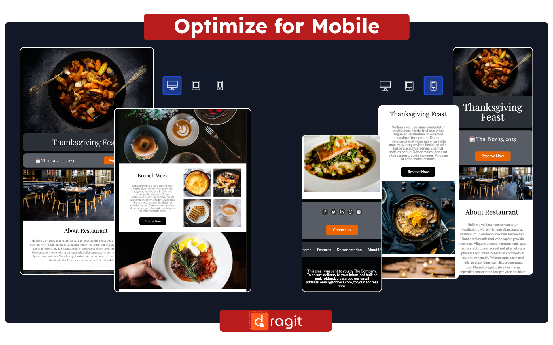
2. Optimize for Mobile
With more than half of all emails being read on mobile devices, designing mobile-friendly emails is crucial. Ensure that your emails are responsive and adapt to different screen sizes. Test how your emails appear on various devices and email clients to ensure a consistent and enjoyable experience for mobile users.
Consider using a drag & drop email editor like Dragit, which offers a collection of professional email templates that are mobile-responsive and easy to customize. With Dragit, you can create visually appealing emails that look great on any device.
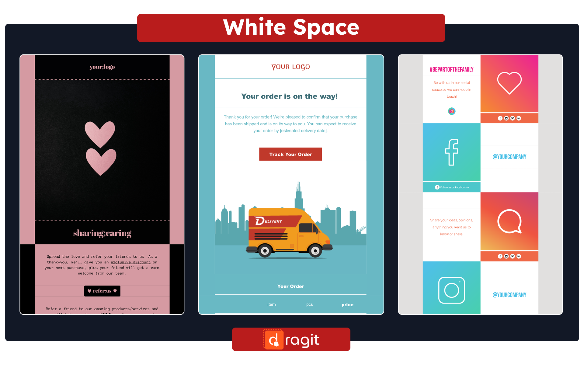
3. Embrace White Space
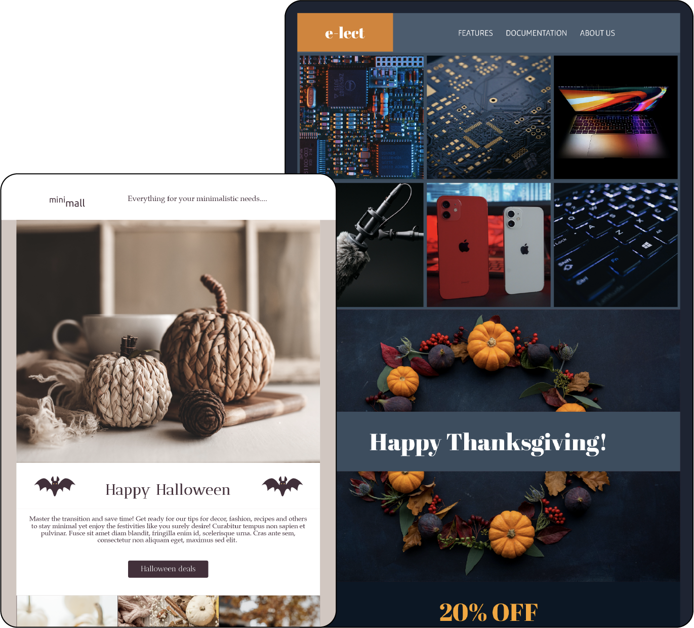
White or negative space is the empty space between elements in your email design. It helps to create a sense of balance and allows the reader's eyes to focus on the critical content. Be generous with white space to provide visual clarity and make your emails easier to scan and comprehend.
Use white space strategically to separate different sections of your email, highlight key messages, and improve readability. This can guide the reader's attention and make your emails more engaging.
4. Utilize Color for Impact
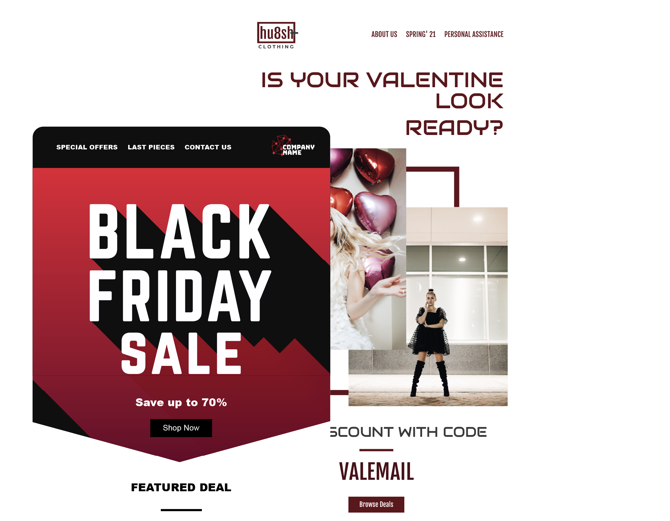
Color is crucial in email design as it evokes emotions, captures attention, and drives engagement. Use colors strategically to direct the reader's focus and create visual interest. Consider the psychology of color and how different colors can convey different meanings and feelings.
Choose a color palette that aligns with your brand identity and use it consistently across your emails. Experiment with different color combinations to find what resonates best with your audience. However, ensure your color choices are accessible to all users, including those with color vision deficiencies.
5. Follow Visual Hierarchies
Visual hierarchy refers to the arrangement of content in a way that guides the reader's attention and emphasizes the most essential elements. By following visual scales, you can make your emails more scannable and help readers quickly grasp the main message.
Consider using the inverted pyramid or Z-pattern layout to structure your emails. The inverted pyramid places the most crucial information at the top, followed by supporting details, and ends with a call to action. The Z-pattern layout follows the natural reading pattern, starting from the top left, moving to the right, diagonally down, and then to the right again.
By utilizing visual hierarchies, you can make your emails more organized, engaging, and effective in conveying your message.
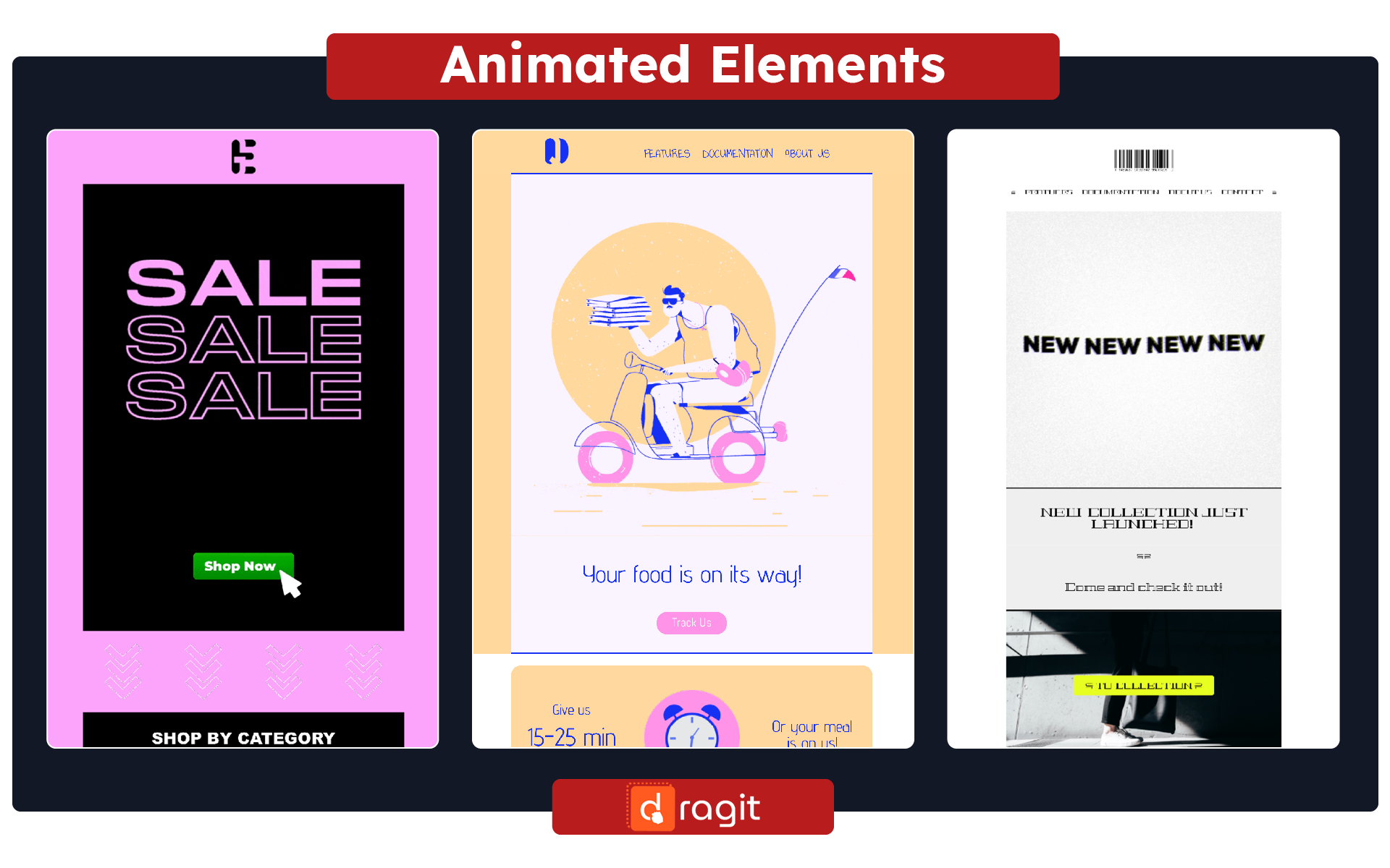
6. Incorporate Dynamic Images
Visual content, such as videos and GIFs, can significantly enhance the engagement of your emails. These dynamic elements capture attention and communicate information more effectively than plain text.
Use videos and GIFs to showcase your products or services, demonstrate how-to guides, or add an interactive element to your emails. Image carousels allow you to display multiple images or offers compactly and engagingly. However, be mindful of the file size of these elements to ensure fast loading times.
With Dragit, you can easily add dynamic content to your emails. Experiment with different types of vibrant images to find what resonates best with your audience and drives higher engagement.
7. Optimize Call to Action (CTA) Buttons
CTA buttons are critical in email design as they drive conversions and guide users to take action. Design your CTA buttons to be visually striking, clear, and easily clickable. Use contrasting colors to make them stand out, and consider the size and placement to ensure they are accessible on both desktop and mobile devices.
Include persuasive and action-oriented copy on your CTA buttons that clearly communicate the desired action. Test different variations of your CTAs to determine what generates the highest click-through rates and conversions. For a deeper dive into the intricacies of button use in emails, check out our article How to design the best call-to-action button, the psychology of color + FREE Email Template Buttons Bonanza.
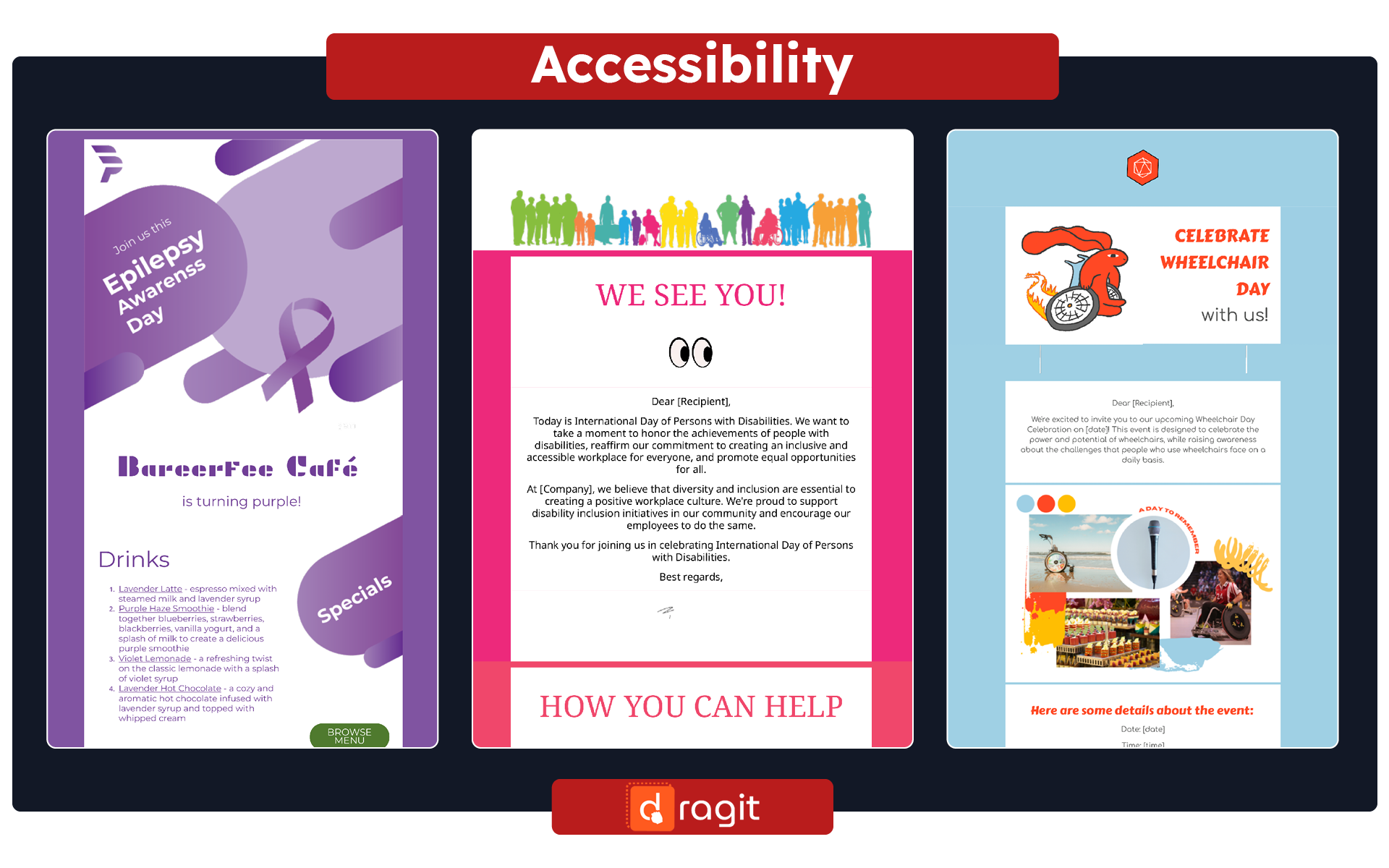
8. Design for Accessibility
Inclusivity is an essential aspect of email design. Ensure your emails are accessible to users with disabilities, such as visual impairments or color vision deficiencies. Use alt text for images to provide descriptions for screen readers and avoid relying solely on color to convey information.
Test your emails with accessibility tools and ensure they render correctly in different email clients. By designing for accessibility, you can reach a wider audience and provide a positive user experience for all recipients.
Conclusion
Enhancing the user experience in email design is crucial for creating engaging and impactful email campaigns. By following best practices such as designing with purpose, optimizing for mobile, embracing white space, and utilizing color strategically, you can create user-friendly emails that capture attention and drive engagement. Incorporating dynamic images, optimizing CTA buttons, and designing for accessibility further enhance the user experience and increase the effectiveness of your email campaigns. With the right approach to email design, you can create memorable and impactful experiences that drive conversions and foster long-term customer relationships.
Remember, consider using a drag & drop email editor like Dragit to simplify creating engaging emails. With its collection of professional templates and easy-to-use interface, you can create visually appealing emails that resonate with your audience and boost your conversions. Sign up for Dragit today and start creating user-friendly and engaging emails that leave a lasting impression.
